DON DESIGN X BEAU BELLA
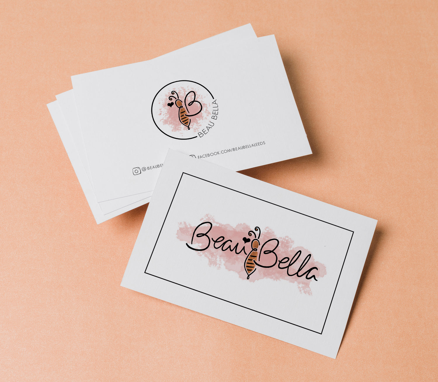
🐝 The Brief
The client approached me to create a fresh new visual identity with a hand-drawn, illustrative feel. They already had a clear colour palette in mind and wanted to feature a bee emblem as part of the logo. A key goal was to roll the branding out across a suite of printed materials — all tied together with luxe rose gold foil details.
✨ The Solution
I explored a range of logo concepts, presenting a few creative directions before landing on a final design that perfectly captured the personality of the brand. From there, I built out a set of custom brand assets, selected complementary fonts, and carefully mapped out where rose gold foil could enhance the designs. I created digital mock-ups to give the client a clear preview of the final look before heading to print.
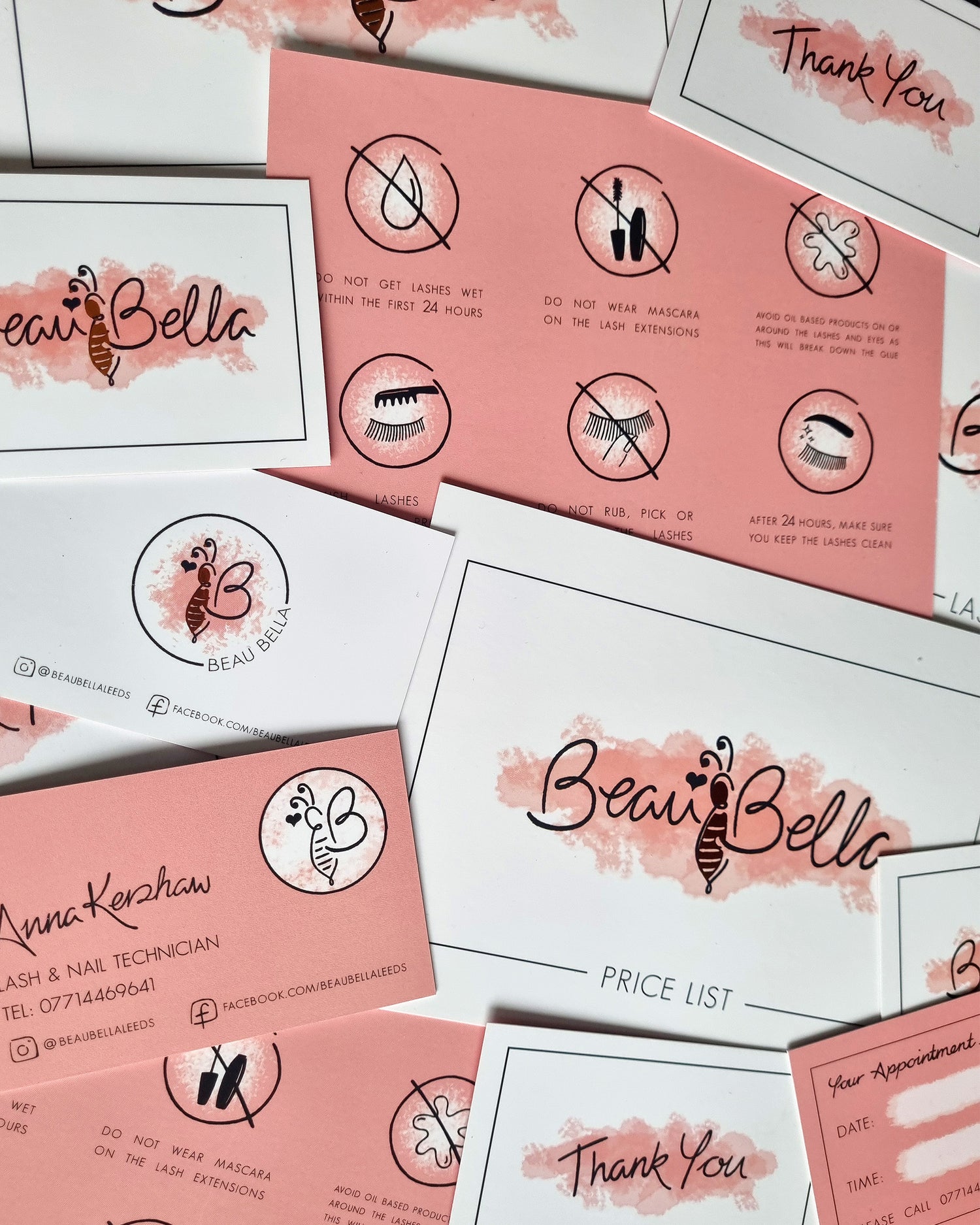
🎨 The Process
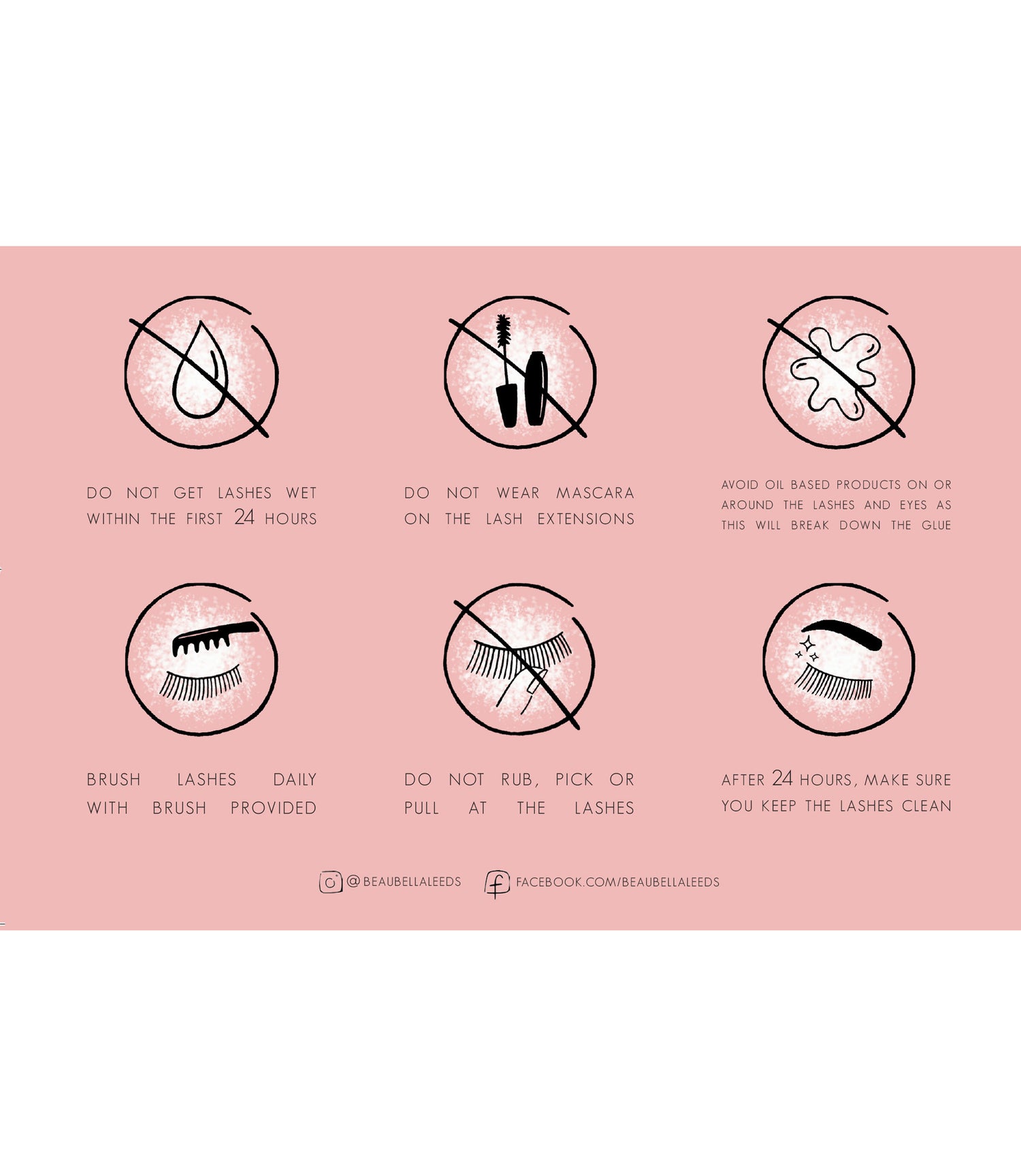
All illustrations were hand-drawn, then scanned and refined in Photoshop. Once finalised, I brought everything into InDesign to lay out a full set of marketing materials — including a business card, thank you card, appointment card, price list, and lash aftercare card. I also managed the final print setup and liaised directly with the printer to ensure everything came out just right.